Creating Movement in Your Pages
Posted: July 13, 2016 | By: Youngevity
As you create your pages, think about how you want those looking at your pages to move around the photos. This typically has to do with the direction the focal point of the photo is pointing. The most effective layouts have a smooth flow rather than having the viewer’s eye jumping around. To help you see how this works, I’ve selected a few pages and added arrows that show the direction the image is directing the eye.
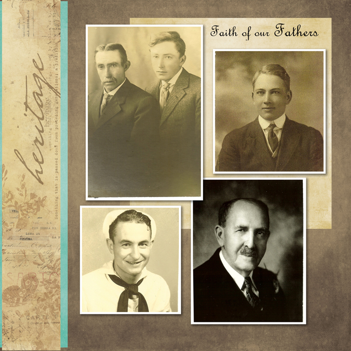
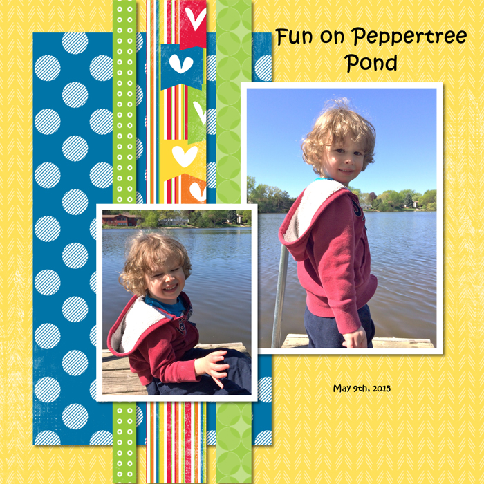
In this layout from Rhonda Anderson using Miracles and Milestones by Katie Pertiet, the flow is subtle. Look at the page for a minute and see where your eye goes and which direction the photos guide you. Got it?
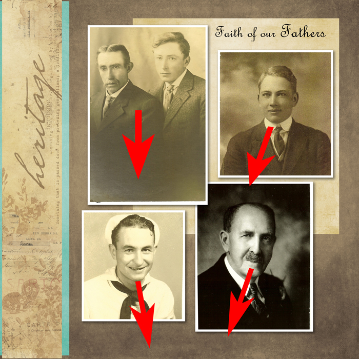
Did you look in the direction that the arrows show? As I mentioned, the flow in this is quite subtle, but if these photos were in different positions, your eye would be moved off the page rather than down and around. Here’s another example.
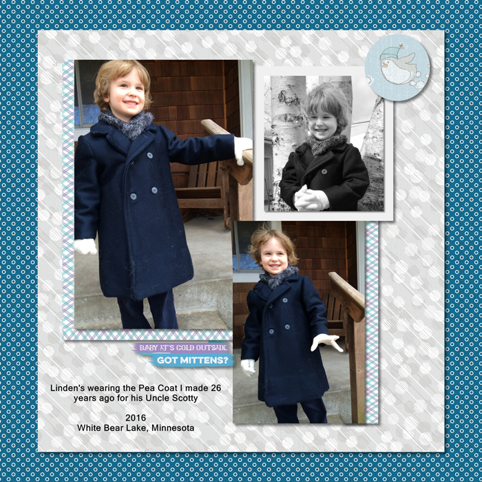
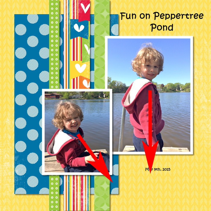
In Kathy Povolny’s layout using Winter Wonders by Katie Pertiet, where does your eye go when you look at each photo? Does it match the arrows below?
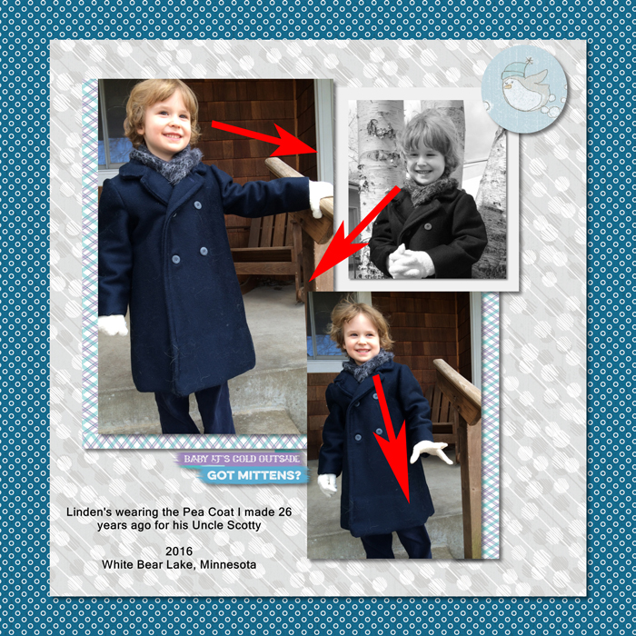
Again, if the top photo and bottom photo were flipped, your eye would move off the page instead of down and to the left. Or if the top right photo were placed on the left side, it would also direct you off the page. Keep in mind that it is not always the photo subject’s eyes that determine the direction. It can be the way they are positioned like the top left photo. Although his eyes are looking slightly up, his body moves you to the right because of the body’s angle.
How about this next one.
If these photos were flipped, you’d move off the page. But because each photo directs you to the center, you stay on the page. This layout is from Kathy Povolny and uses the It’s a Kid’s World by Lauren Hinds. Here’s the version with the arrows.
These next two just show the arrow version.
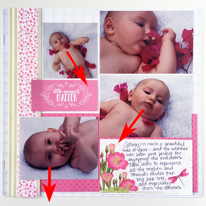
Lauren Hinds used the Floral Flourish by Katie Pertiet collection to record her love for her sweet baby. See how the baby’s eyes move you around the page in a smooth flow? Great photo placement!
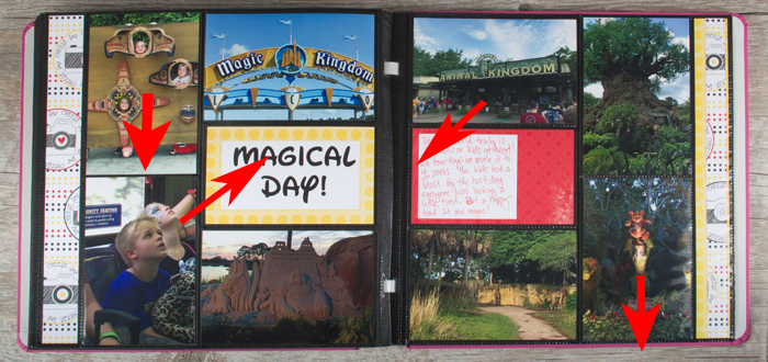
This final layout, using It’s a Kid’s World by Lauren Hinds, shows how objects as well as people can help direct flow in a page. The little boy in the bottom left directs your eye up and the Animal Kingdom sign directs you down and to the left because of the angle of the sign. Had that photo been on the other page, it would have kept you on that page rather than helping move you between the two pages of the layout.
I hope this helps you as you place photos and accents on your page to look at how your eye moves around the page. It can make a huge difference in how you feel about your layout and ensure a pleasing experience for those looking at your pages.
Have fun creating!
– StacyC
Posted in: